Statement art prints can transform a room from forgettable to unforgettable in a single hanging. But there's a delicate balance between making an impact and creating visual chaos. The difference between a gallery-worthy wall and a cluttered mess often comes down to restraint, placement, and understanding how bold artwork interacts with your existing space. Whether you're drawn to vintage pop culture references or abstract compositions, the key is letting your statement pieces breathe while ensuring they feel intentional rather than accidental.
Understanding What Makes Art "Statement-Worthy"
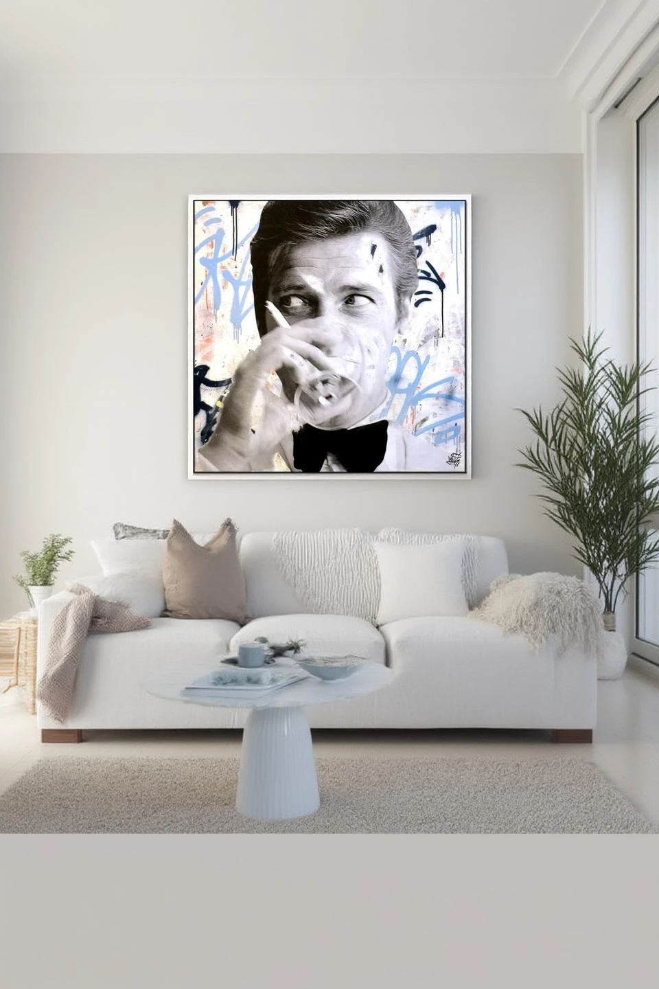
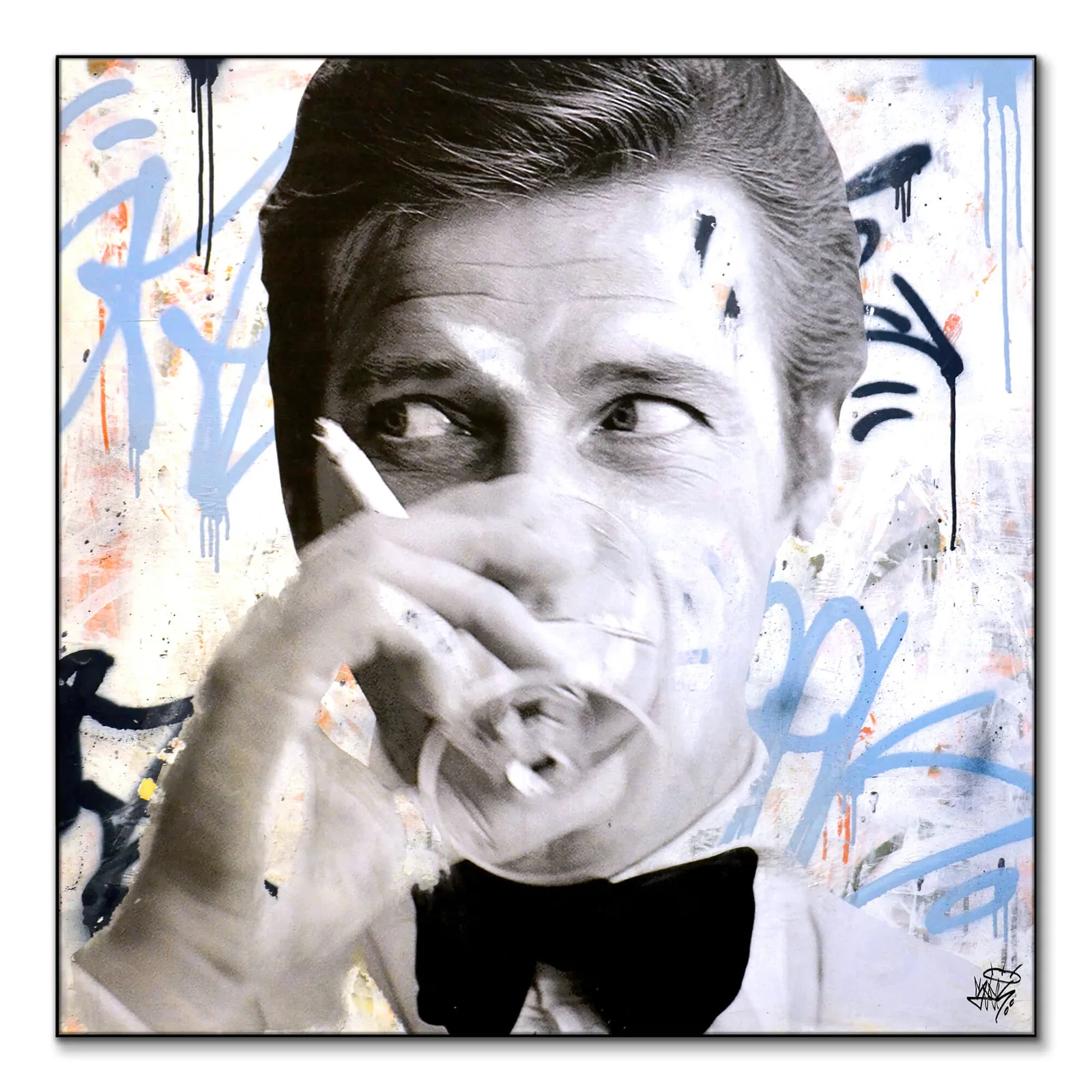
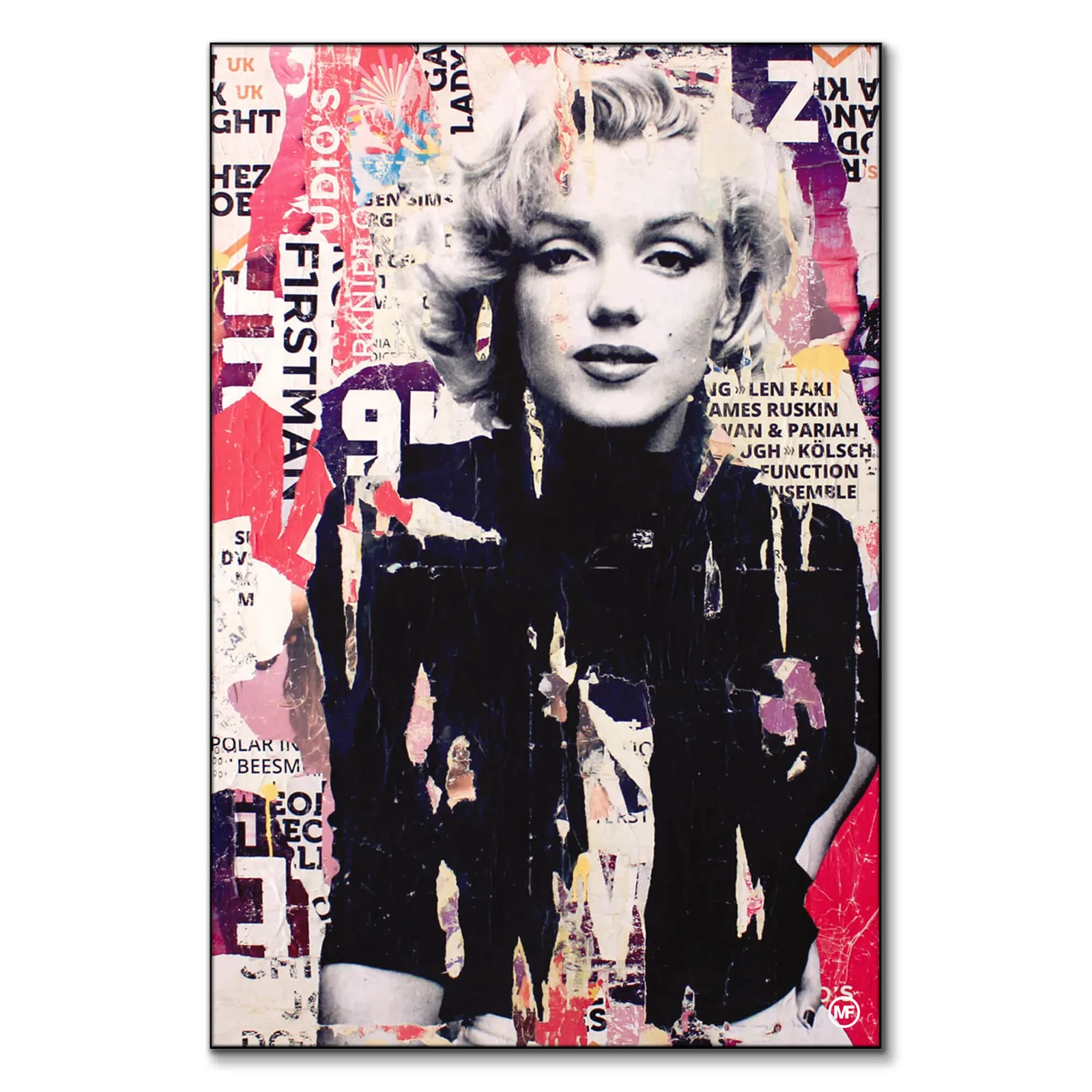
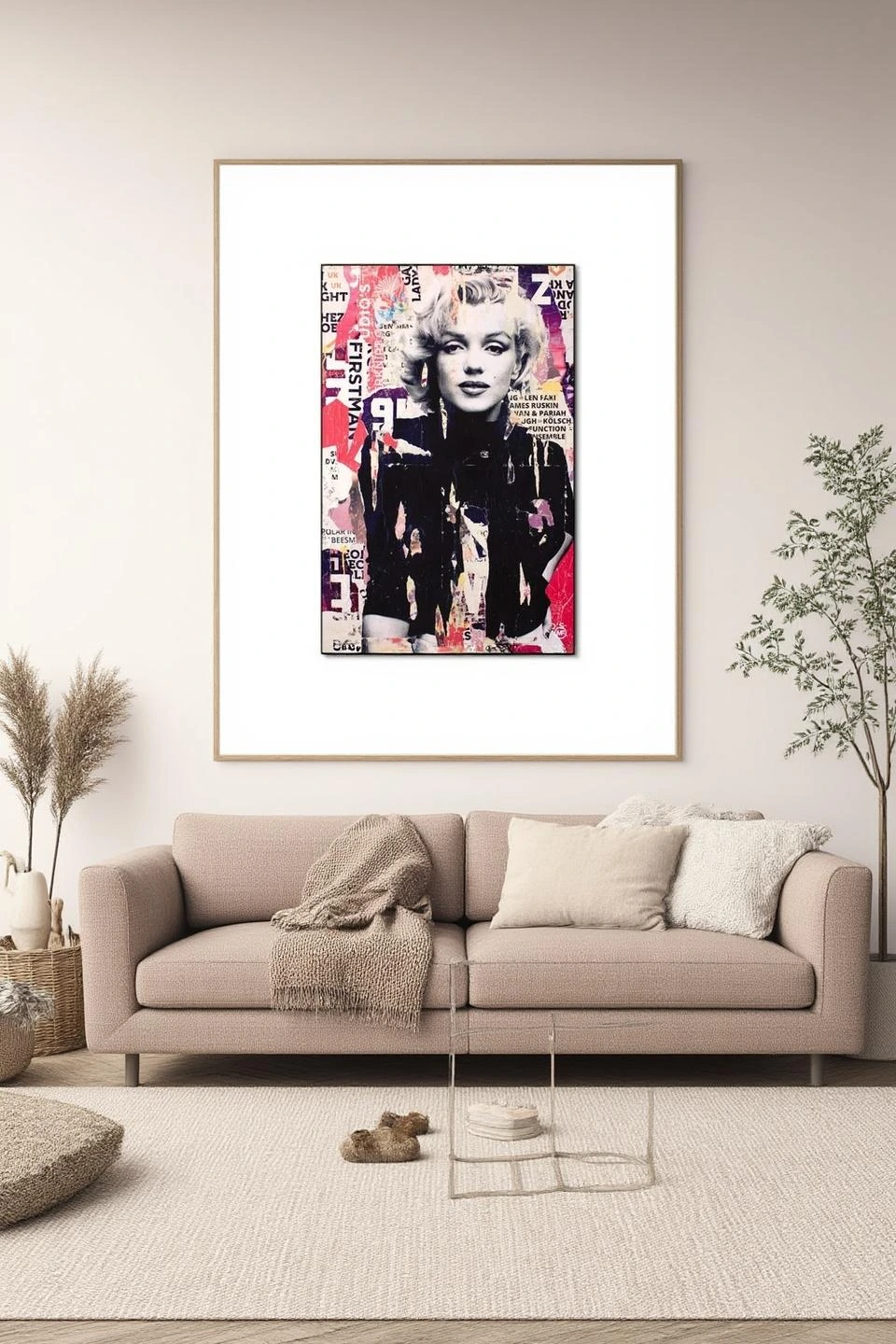
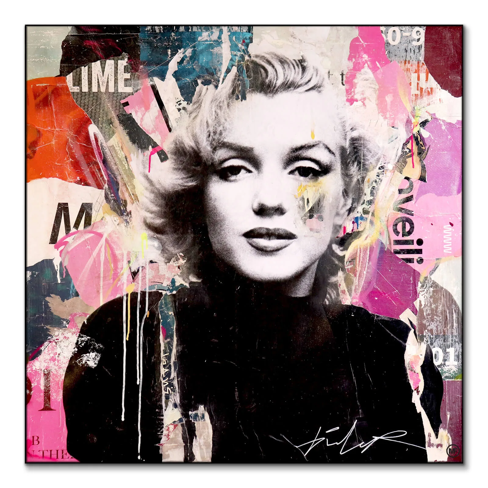
Not every print qualifies as a statement piece, and that's perfectly fine. A statement print commands attention through size, color intensity, subject matter, or compositional boldness. It's the piece that stops conversations when guests enter a room. Works like the James Bond Martini with its iconic imagery or the Marilyn Monroe Collage with its layered vintage aesthetic fall into this category—they're inherently eye-catching and unapologetically bold.
The scale matters tremendously. Generally, anything 24x36 inches or larger enters statement territory, though a smaller piece with explosive color or dramatic subject matter can punch above its weight class. Consider the visual weight of your art, not just its physical dimensions. A minimalist line drawing at 40 inches might whisper where a 20x24 inch piece with saturated colors and complex patterns shouts.
When browsing Arts & Crafts for your next focal piece, ask yourself whether the work has enough visual interest to anchor a wall on its own. If you find yourself immediately imagining what you'd hang beside it, it might not be the statement piece you're after—it might be a supporting player in a future gallery wall.
Choosing the Right Wall and Position
Location determines whether your statement art elevates your space or overwhelms it. Not every wall can handle a bold print, and forcing one into the wrong spot creates tension rather than harmony. Your best candidates are walls with natural focal points: the space above a sofa, behind a dining table, at the end of a hallway, or opposite the entrance to a room where it's the first thing visitors see.
Measure your wall carefully and apply the two-thirds rule: your statement piece should occupy roughly two-thirds the width of the furniture beneath it. A common mistake is choosing artwork that's too small, leaving it floating awkwardly rather than anchoring the space. If you're working with a 90-inch sofa, you're looking at art that's approximately 60 inches wide, either as a single piece or a tightly grouped arrangement.
Eye level placement remains the golden rule, positioning the center of your artwork 57-60 inches from the floor—the standard gallery height. This feels natural because it's where our eyes naturally fall in conversation. The exception? Dining rooms, where you'll want to account for seated viewing heights, dropping the center point slightly lower for optimal appreciation during meals.
Avoid walls that already compete for attention. A fireplace wall with intricate tilework, a wall of windows, or a space with complex architectural details dilutes the impact of statement art. Similarly, narrow walls between doorways or corners with heavy traffic don't provide the breathing room bold pieces need to shine.
Balancing Color and Pattern Throughout the Room
A statement print introduces a color story that should echo—not match—elsewhere in your room. The goal is creating visual conversations between your art and your space without descending into theme-park coordination. Pull one or two accent colors from your artwork and let them reappear in throw pillows, ceramics, or textile choices, but resist the urge to match every hue exactly.

James Bond Martini
PARTB Curated · Featured in this article
If your statement piece features intense saturation, your surrounding palette should lean quieter. A bold abstract with multiple vibrant colors needs the anchor of neutral walls and furnishings to avoid sensory overload. Conversely, if you're working with prints that have substantial negative space or muted tones like Hazy Treetops, you have more freedom to introduce pattern and color elsewhere without competition.
Pattern mixing requires a particularly light touch when statement art is involved. Your print already provides visual complexity; adding busy rugs, patterned curtains, and heavily printed upholstery creates a battlefield where nothing wins. Choose one additional pattern at most, and ensure it operates at a different scale than your artwork. If your print features small, detailed elements, your secondary pattern should be large and loose, or vice versa.
Consider the undertones in your art when selecting paint colors. Cool blues and grays in a print clash with warm beige walls even when both seem "neutral." Bring paint swatches home and hold them near your artwork in different lighting conditions—morning, afternoon, and evening—before committing. What looks harmonious at the store often reveals discordant undertones in your actual space.
Framing and Matting Decisions That Matter
The frame isn't an afterthought; it's the boundary that separates your statement piece from the surrounding wall, and the wrong choice undermines even exceptional artwork. As a general principle, bold artwork benefits from simple frames. Ornate, heavily carved frames compete with complex compositions, while sleek profiles—thin black metal, natural wood, or simple white—provide structure without distraction.
Matting offers breathing room, especially important for statement pieces that need physical separation from your wall color. A generous mat—three to four inches on all sides—creates a buffer zone that prevents even vivid walls from crowding your art. White and off-white mats work universally, but don't dismiss colored mats entirely. A subtle gray or cream mat can soften the transition between artwork and wall when white feels too stark.
For pieces like I Defy Gravity or other works with plenty of internal contrast, consider floating the art within a deep frame. This shadowbox effect adds dimensional interest and emphasizes the artwork as an object rather than just an image, particularly effective in contemporary spaces where depth and texture matter as much as color and subject.
Glass decisions impact your piece's presence significantly. Regular glass creates reflections that obscure artwork depending on light sources and viewing angles. Museum glass costs more but eliminates nearly all glare while providing UV protection—worthwhile for statement pieces where you've invested both money and emotional energy. Acrylic is lighter and safer for large pieces but scratches more easily and carries static that attracts dust.
Creating Visual Breathing Room With Negative Space
The empty wall around your statement art isn't wasted space—it's the silence between musical notes that makes the melody intelligible. Overcrowding a bold piece with nearby shelving, adjacent smaller artworks, or flanking sconces dilutes its impact and creates visual competition. Your eye doesn't know where to land, so it settles nowhere, making the entire arrangement feel chaotic.
I Defy Gravity
PARTB Curated · Featured in this article
Establish a twelve-inch minimum perimeter around your statement piece where nothing else lives. This buffer zone lets the artwork command attention without interference. If you're working with a particularly bold piece with explosive color or complex imagery like Mellisonant Fall, expand that perimeter to eighteen inches or more. The more intense the artwork, the more breathing room it requires.
Resist the urge to fill every nearby surface with decorative objects that "relate" to your art's theme or color palette. If you've hung a statement piece with strong blues, you don't need blue vases, blue books, and blue ceramics on the console beneath it. One or two subtle echoes are sufficient—anything more feels forced and diminishes rather than enhances your focal point.
Vertical breathing room matters as much as horizontal. The space between your statement art and the furniture below should be proportional to both elements. Six to eight inches works for most arrangements, but adjust based on your ceiling height and furniture scale. Higher ceilings accommodate slightly wider gaps, while lower ceilings benefit from tighter relationships between art and furniture.
Working With Lighting to Enhance Rather Than Overpower
Even the most carefully chosen statement print falls flat in poor lighting conditions. Natural light is ideal but requires management—direct sunlight fades pigments over time, while harsh afternoon light creates glare on glass. Sheer curtains filter intensity while maintaining brightness, and UV-protective glass provides insurance against premature fading.
For artificial lighting, aim for even illumination rather than dramatic spotlighting unless you're deliberately creating a gallery effect. Track lighting or adjustable picture lights give you control over direction and intensity, letting you highlight your artwork without casting harsh shadows or creating hot spots. LED options with high color rendering indices (CRI of 90 or above) show colors accurately rather than skewing them toward blue or yellow.
Avoid placing statement art on walls opposite bright windows where it becomes backlit and difficult to appreciate. Similarly, walls that receive direct light only at specific times of day present challenges—your artwork looks spectacular at three o'clock but disappears into shadow by five. Test your proposed location at different times before committing to permanent hanging.
Layer your lighting for maximum flexibility. Combine picture lights with ambient room lighting so you can adjust the emphasis based on time of day and mood. Your statement piece should remain visible and attractive whether you're reading with full overhead lights or entertaining with softer, atmospheric illumination.
Editing Your Supporting Cast
Once your statement piece is hung, evaluate everything else in the room through a critical lens. Bold artwork often exposes clutter and excess that previously flew under the radar. Small decorative items that felt necessary suddenly look like distractions. Walls that seemed empty now appear well-balanced. This is your opportunity to edit ruthlessly.
Mellisonant Fall
PARTB Curated · Featured in this article
Remove competing focal points. If your statement art hangs above the sofa, the gallery wall in the adjacent corner now fights for attention rather than complementing the space. Consider relocating smaller pieces to hallways, bedrooms, or home offices where they can shine independently rather than competing with your main attraction.
Furniture arrangement deserves fresh consideration. Is your sofa positioned to allow comfortable viewing of your new artwork? Can you appreciate the piece from multiple seating areas, or does it only work from one specific angle? Sometimes a simple furniture rotation creates better sightlines and strengthens the relationship between your statement art and the room's flow.
Accessories on nearby surfaces should enhance without echoing. If your statement print features botanical elements, you don't need potted plants clustered beneath it hammering home the nature theme. Contrast often works better than similarity—let your geometric abstract pop against organic sculptural objects, or balance a vintage collage with sleek modern accessories.
Trust the power of restraint. Your space doesn't need multiple statement pieces competing for dominance. One bold artwork per room is typically sufficient, with supporting pieces playing quieter, complementary roles. The result feels curated rather than collected, intentional rather than accumulated—exactly the aesthetic that distinguishes truly stylish spaces from merely decorated ones.
The art on your walls reveals as much about your editing skills as your taste in imagery. When you get the balance right, your statement piece feels inevitable, as though the room was always waiting for exactly that artwork in exactly that spot. Everything else fades into thoughtful support, letting your bold choice command the attention it deserves.
Our Frequently asked questions section below addresses common concerns about hanging, protecting, and living with statement art prints in your home.
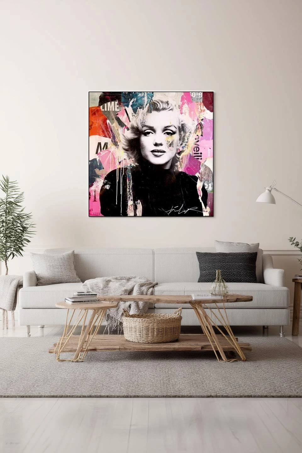
Marilyn Monroe Collage
PARTB Curated · Featured in this article
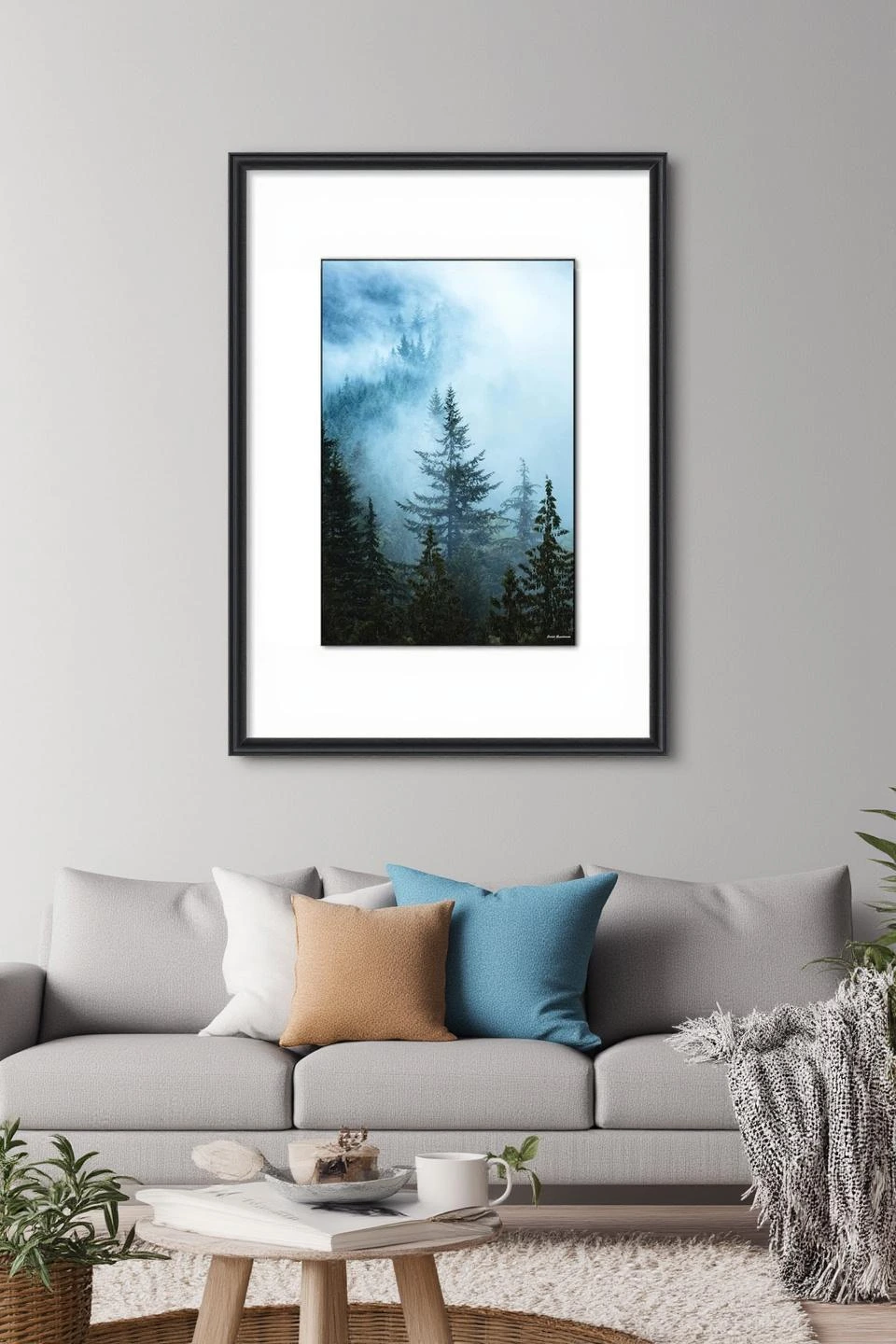
Hazy Treetops
PARTB Curated · Featured in this article