Living far from the ocean doesn't mean you can't bring its calm, restorative energy into your home. The challenge is finding that sweet spot between "I appreciate the coast" and "I run a boardwalk gift shop." Coastal art, when chosen and styled thoughtfully, can evoke memory, atmosphere, and a sense of place without resorting to rope-framed mirrors and mass-produced "Life's a Beach" signs. The difference lies in treating coastal imagery as genuine art rather than theme-park decoration—selecting pieces with strong composition, restraint, and personal resonance, then integrating them into your space with the same intention you'd give any meaningful artwork.
Rethink What "Coastal" Actually Means
Before you start shopping, expand your mental definition beyond sailboats and lighthouses. The coast isn't a single aesthetic—it's dozens. There's the windswept drama of the Pacific Northwest, the pastel softness of Mediterranean shores, the stark geometry of modernist beach architecture, the wild tangle of dune grasses. When you're hundreds of miles from salt water, the most effective coastal art often captures a feeling rather than a literal scene. Look for pieces that emphasize light, horizon lines, texture, or color palettes inspired by the shore rather than explicitly depicting it. Abstract work referencing sand, sky, and water through color and form can feel more sophisticated and less literal than another sunset-over-waves print.
This approach also gives you permission to mix coastal elements with your existing style. A piece exploring the intersection of ocean and geometric abstraction works beautifully in a mid-century home. Moody, atmospheric seascapes complement industrial or Scandinavian spaces. The key is choosing work that speaks to the emotional quality of the coast—contemplation, vastness, the interplay of light and space—rather than checking off a visual checklist of beachy signifiers.
Choose Art with Visual Restraint
The fastest route to cliché is overstatement. Effective coastal art for landlocked homes often employs a restrained palette and composition. Look for pieces that use coastal colors—sandy neutrals, soft grays, blues ranging from pale aqua to deep navy—but deploy them with sophistication. Monochromatic or limited-palette work tends to feel more curated and less novelty-driven. A charcoal drawing of erosion patterns, a photograph emphasizing the graphic quality of a pier's structure, or an abstract piece suggesting tidal movement through gestural marks all reference the coast without announcing it.
Photography can be particularly effective when it focuses on detail or unexpected perspectives rather than postcard vistas. Close-ups of weathered wood, patterns in sand, the play of light through beach grass—these intimate views often carry more emotional weight than sweeping panoramas. They ask the viewer to slow down and notice, which is precisely the mental state many of us seek from coastal environments. When browsing options in the Arts & Crafts category, prioritize pieces that would stand on their own compositional merit even if they depicted something entirely different.
Layer Through Texture, Not Quantity
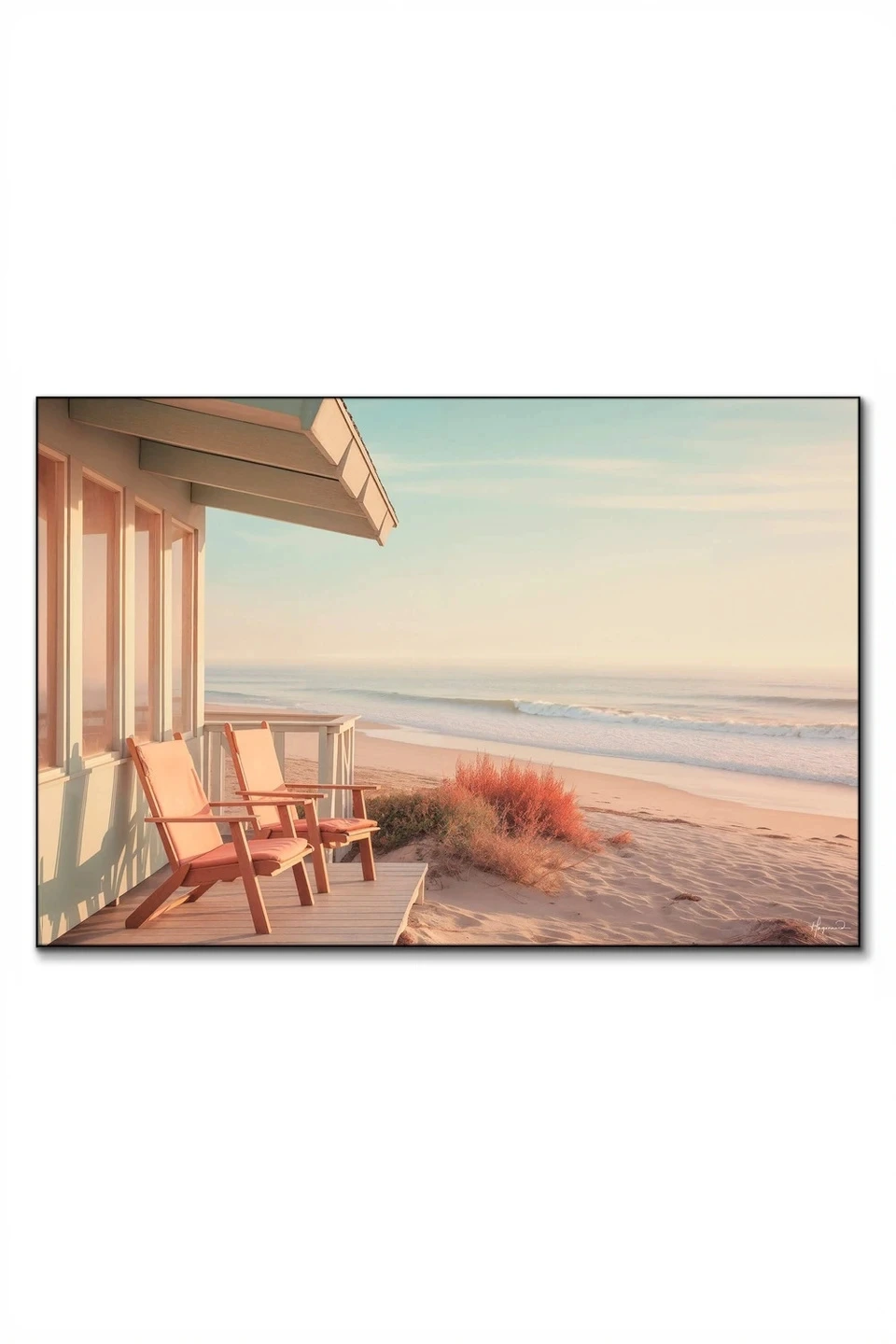
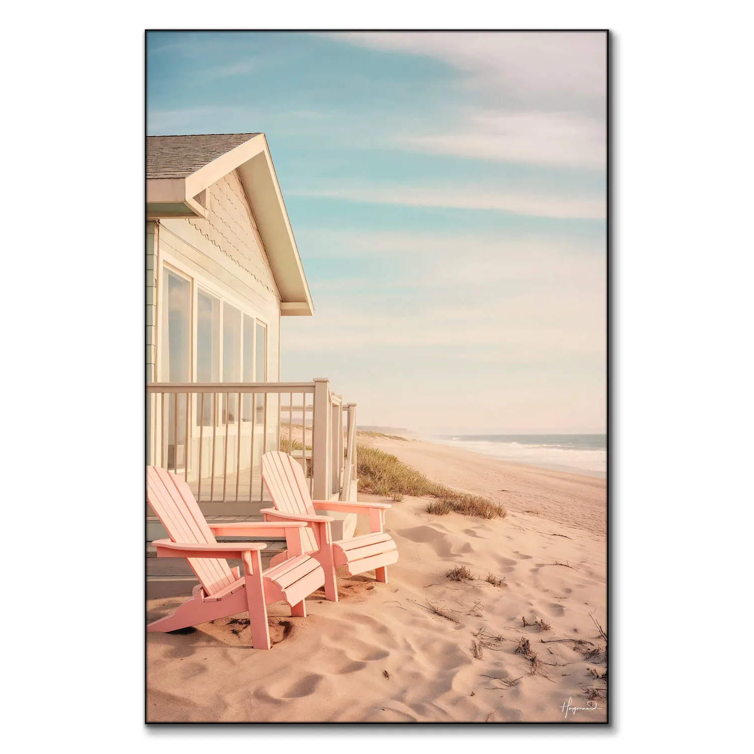
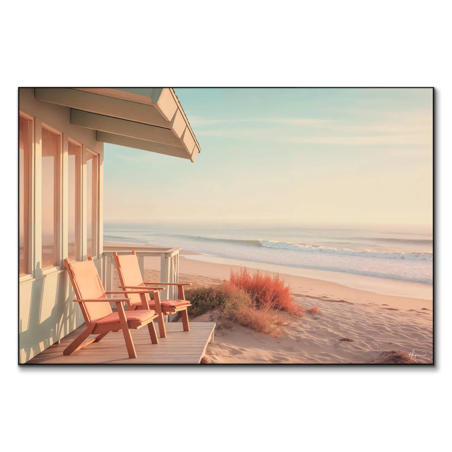
One large-scale piece almost always outperforms a wall of smaller coastal prints. Scale commands attention and grants legitimacy—it signals that this is art you've chosen deliberately, not filler to cover blank walls. A substantial canvas or framed photograph becomes a focal point and sets the tone for the room without requiring backup from a fleet of supporting images. If you're working with a piece like Along the Beach, which captures coastal atmosphere through color and form, let it breathe. Give it wall space, flank it with negative space, and resist the urge to surround it with thematic reinforcements.
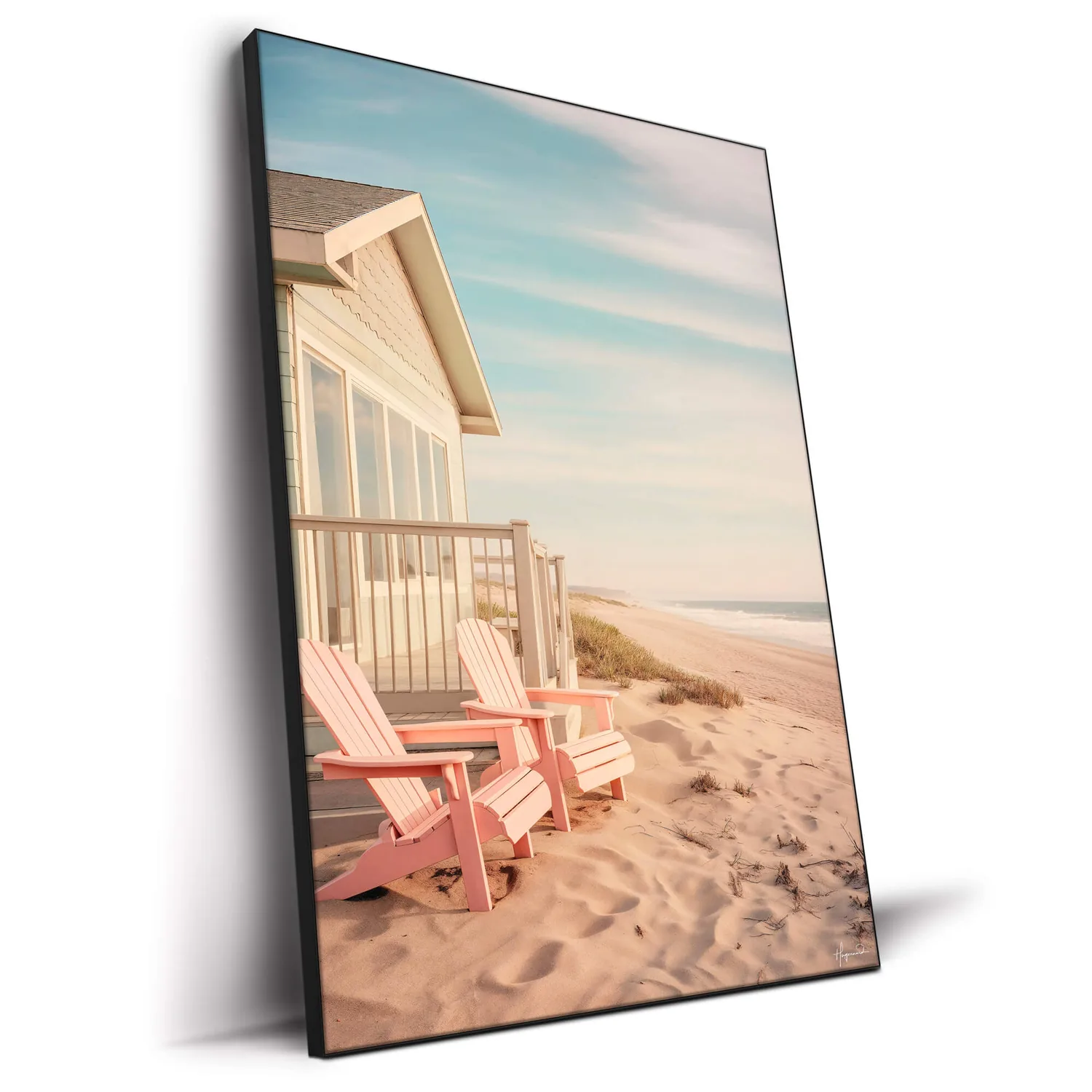
Along the Beach
PARTB Curated · Featured in this article
If you do want to incorporate multiple pieces, vary the medium and texture rather than repeating the same visual language. Pair a photograph with a painting, or balance a detailed work with something more abstract. Mix framing styles—a raw canvas edge next to a clean white mat, or a slim black frame alongside natural wood. This variation keeps the space from feeling like a themed collection and instead creates the sense of pieces gathered over time because each spoke to you individually. The goal is a collected, layered look rather than a matching set.
Integrate, Don't Isolate
Coastal art fails when it exists in a vacuum, surrounded only by other coastal references. The most successful installations weave these pieces into a broader visual conversation. Hang coastal photography alongside portraiture, still life, or abstract work. Let a seascape share a wall with family photos or vintage finds. This integration prevents the space from tipping into theme territory and allows the coastal elements to function as part of your larger aesthetic rather than defining it entirely.

Consider unexpected placements as well. Coastal art doesn't have to live in the bathroom or bedroom—in fact, those are often the most predictable locations. A serene coastal piece can anchor a home office, providing a visual exhale during stressful workdays. Dramatic seascapes work beautifully in dining rooms, where their scale and moodiness create atmosphere without competing with conversation. An abstract piece referencing water and light might be the perfect counterpoint to a gallery wall of bold, busy prints in a living room.
Mind Your Color Relationships
Here's where many coastal installations go wrong: they lean too hard into expected color pairings. Yes, navy and white are classic nautical colors, but when every element in a room echoes that palette, the result feels costume-like. Instead, use your coastal art as a color anchor and then diverge in interesting ways. If your piece emphasizes sandy beiges and soft blues, introduce warm terra cotta, deep green, or even blush pink elsewhere in the room. These unexpected companions keep the palette dynamic and prevent that "catalog page" look.
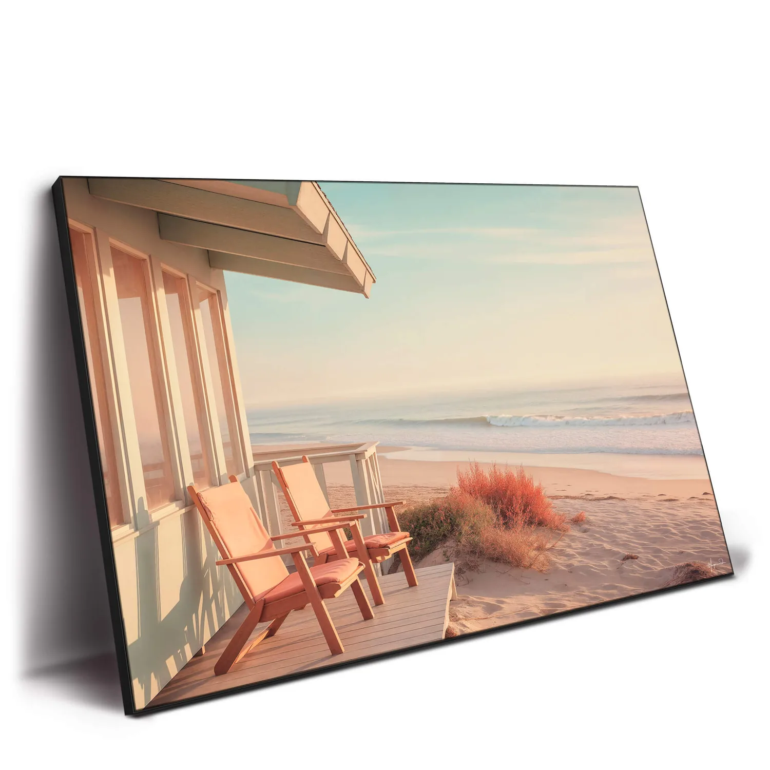
Sandy Coastal Dreams
PARTB Curated · Featured in this article
Pay attention to undertones as well. Coastal colors can skew warm (peachy sands, greenish-grays) or cool (silvery blues, stark whites), and mixing undertones carelessly creates visual discord. If your art features warm, sun-bleached tones, echo those warmth cues in your wood finishes, textiles, and accent colors. Cool-toned pieces pair beautifully with crisp whites, concrete or stone textures, and metals like brushed nickel or aged pewter. This tonal consistency creates cohesion without relying on literal matching.
Balance Subject Matter Across Your Space
If you commit to coastal art in one room, be thoughtful about how much coastal energy you introduce elsewhere. A home where every room features beach imagery starts to feel single-note, no matter how refined the individual pieces. Consider limiting strong coastal references to one or two spaces, then incorporating subtler nods elsewhere—perhaps a piece like Sandy Coastal Dreams in the living room, where its atmosphere can shine, while other rooms explore different themes and moods.

This doesn't mean you can't have visual threads running through your home, but those threads should be about color, style, or mood rather than subject matter. If you love the calm, contemplative quality of coastal imagery, seek out that same feeling in abstract work, landscapes from entirely different regions, or even figurative pieces with similar tonal qualities. The emotional through-line matters more than thematic consistency.
Consider the Frame as Part of the Conversation
Framing choices can either elevate coastal art or drag it toward souvenir territory. Avoid anything explicitly nautical—no rope detailing, no weathered-look frames with anchors in the corners, no driftwood assemblages unless the piece itself is exceptionally strong. Instead, treat coastal art exactly as you would any other serious artwork. Clean-lined frames in black, warm wood tones, or even metallics allow the image to speak without adding editorializing commentary.

James Bond Martini
PARTB Curated · Featured in this article
For photography, consider floating the print within a deeper frame to create dimension, or opt for a gallery-style presentation with generous white matting. Canvas work often looks best either frameless with gallery-wrapped edges or in a minimalist float frame that creates shadow and depth. The frame should enhance the piece's composition and color palette, not announce its subject matter. This restraint is what separates thoughtful art installation from decorative theming.
Trust Your Instincts Over Rules
The surest way to avoid cliché is to choose work that genuinely moves you rather than checking boxes for a coastal aesthetic. If you find yourself drawn to a piece primarily because it "goes with the theme," step back and ask whether you'd still love it in a different context. The best art for your home—coastal or otherwise—should create an emotional response that goes beyond its decorative function. It should offer something to return to visually, reveal new details over time, or simply make you feel more like yourself when you're in the room with it.
This might mean your coastal collection looks nothing like anyone else's. You might gravitate toward stormy, dramatic seascapes instead of sunny beach scenes, or abstract interpretations rather than literal representations. That individuality is precisely what keeps your space from feeling derivative. Your home should reflect your specific relationship with coastal environments—the memories, emotions, and associations that make them meaningful to you—rather than a generic "beachy" ideal.
Creating Lasting Appeal
The question to ask isn't "Does this look coastal?" but rather "Will this piece still feel relevant to me in five years?" Trends in coastal decor shift—right now we're moving away from the aqua-and-coral palette that dominated a decade ago toward more sophisticated, neutral-forward coastal aesthetics—but strong art transcends these cycles. Pieces with solid composition, thoughtful color use, and genuine artistic merit won't suddenly feel dated when the next wave of design trends arrives. They'll continue to offer visual interest and emotional resonance regardless of what's currently popular.
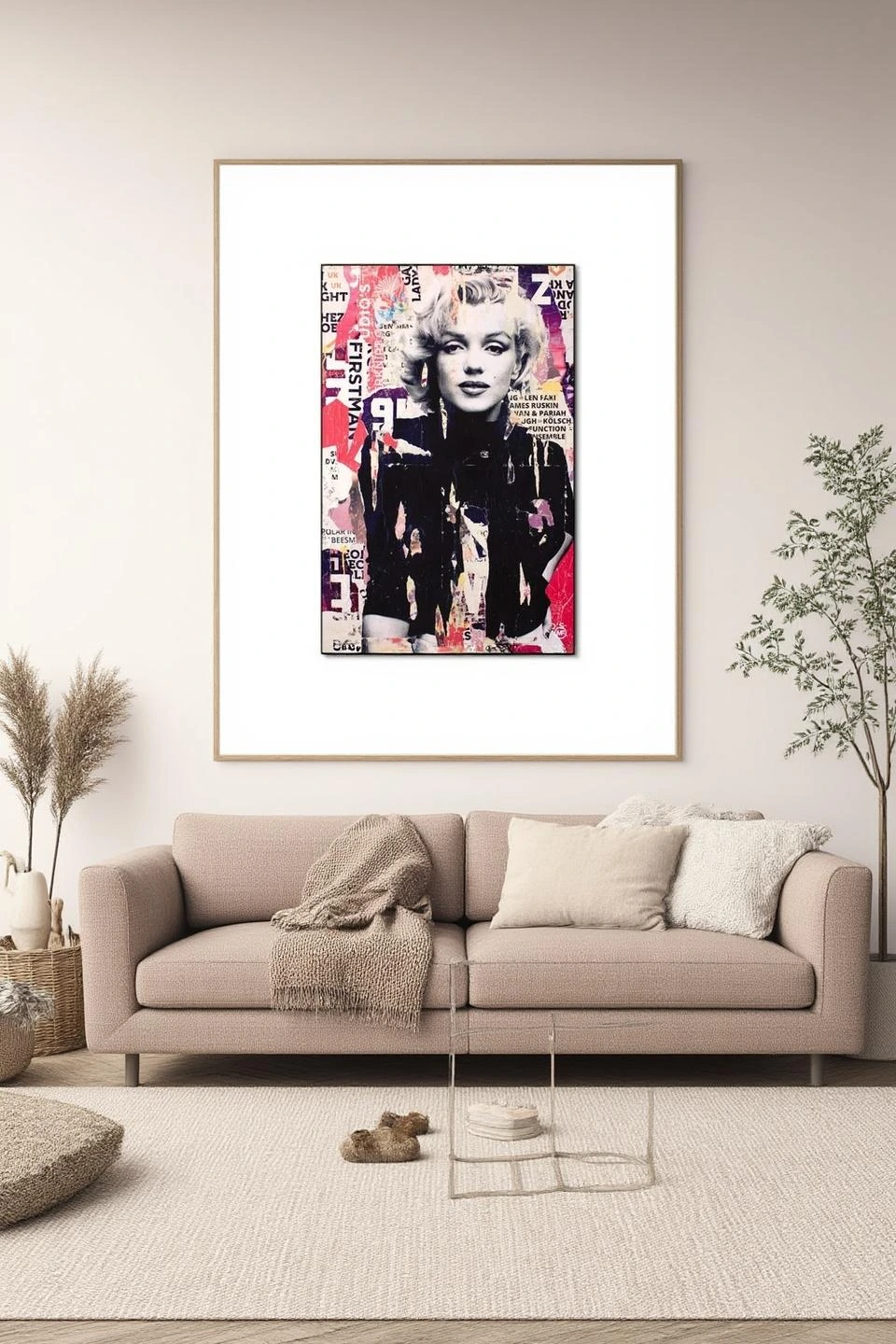
I Defy Gravity
PARTB Curated · Featured in this article
This long-view approach also means being selective rather than accumulating. One or two really exceptional pieces will always outperform a wall full of okay ones. Take your time, live with empty wall space if necessary, and wait for work that truly resonates. The patience pays off in spaces that feel intentional and personal rather than hastily assembled around a theme.
The following section addresses common questions about styling coastal art in landlocked homes, offering additional guidance for creating spaces that feel inspired by the shore without succumbing to cliché.
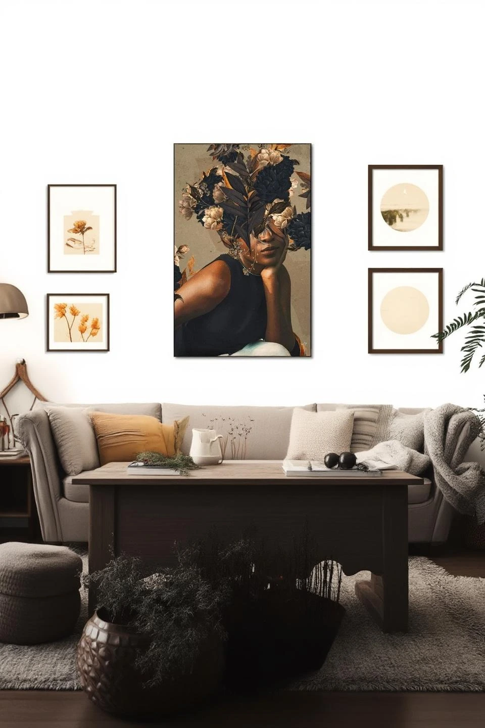
Mellisonant Fall
PARTB Curated · Featured in this article