
Mixing pop culture art with nature prints might sound like decorating oil and water, but when done thoughtfully, this combination creates spaces with genuine personality and visual intrigue. The key lies in understanding that both genres share a common language of form, color, and mood—they just speak different dialects. Rather than keeping your iconic celebrity portraits in one room and your botanical prints in another, bringing them together on the same wall or within the same space adds layers of meaning and prevents your home from feeling too theme-parky or one-note.
The secret is treating both categories with equal respect. Your nature prints aren't just filler between your prized pop culture pieces, and your pop culture art isn't merely an ironic punctuation mark among serious landscape work. When you approach the pairing as a conversation rather than a competition, you'll find surprising harmonies emerge.
Why This Pairing Actually Works
Pop culture art and nature prints operate on different frequencies, which is precisely why they complement each other. Pop culture pieces—whether they're iconic photographs, graphic interpretations, or collage work—tend to be bold, figurative, and immediately recognizable. They create instant focal points and often carry nostalgic or emotional weight. Nature prints, on the other hand, provide breathing room. They're usually more subdued, contemplative, and create a sense of calm that prevents a space from feeling visually exhausting.
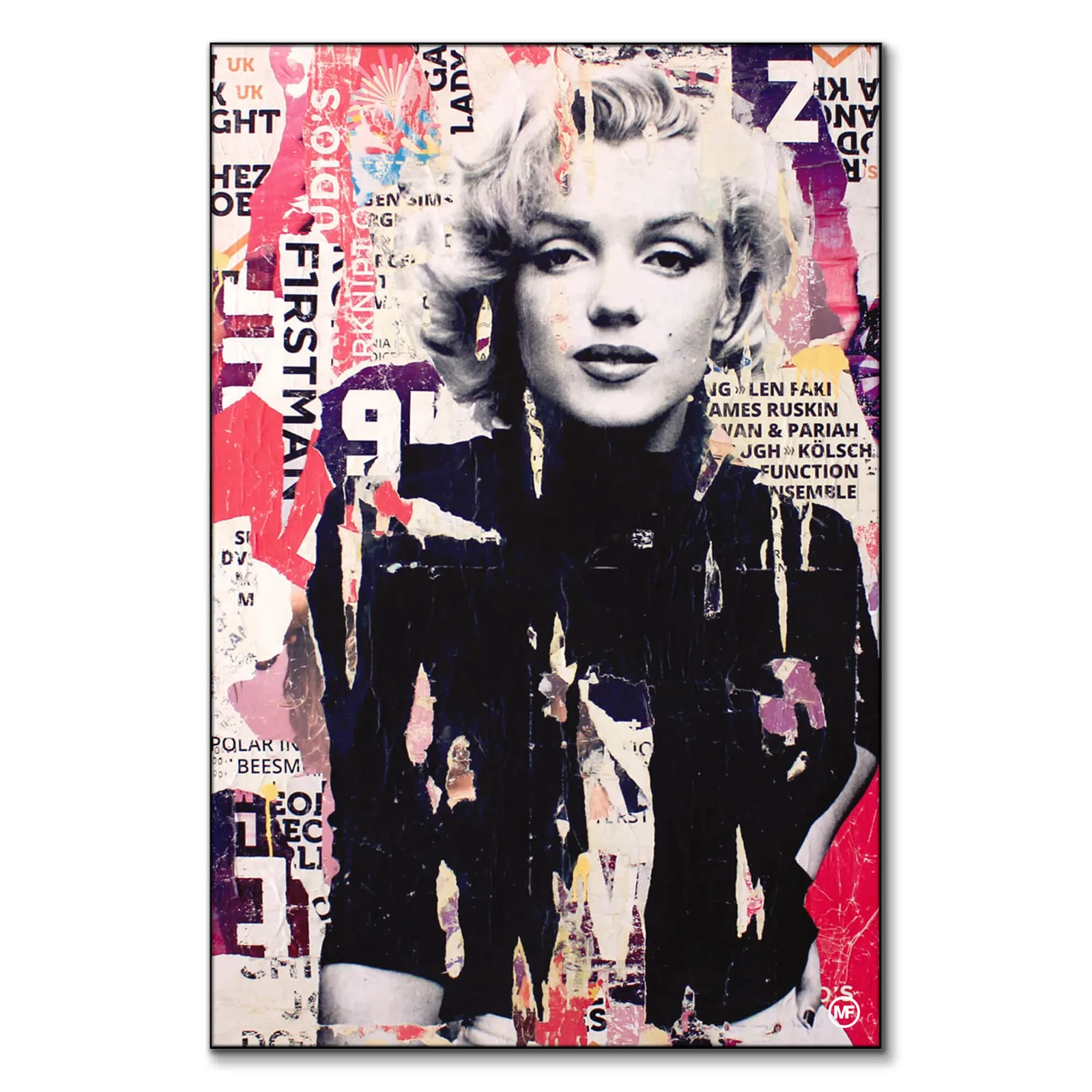
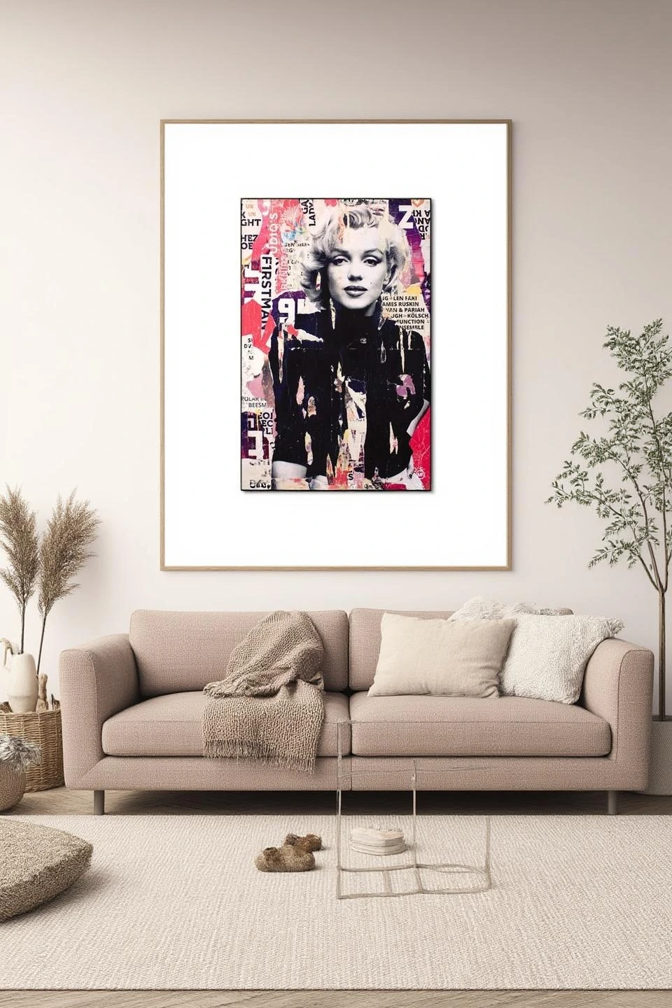
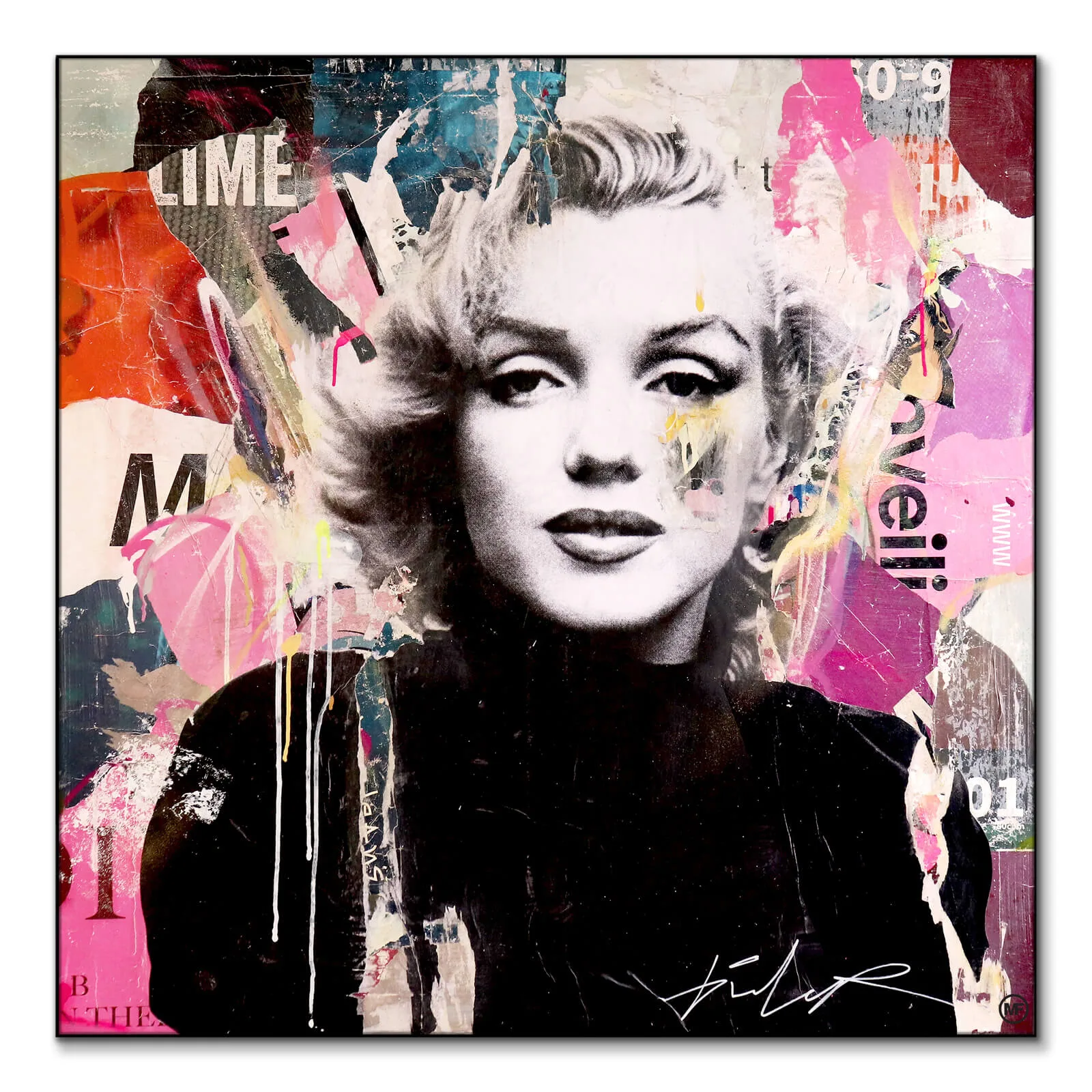
This dynamic tension is what makes the pairing successful. A striking piece like the Marilyn Monroe Collage commands attention with its layered imagery and cultural heft, but when placed near something softer like Hazy Treetops, each piece actually becomes more interesting. The collage feels more sophisticated when it's not competing with similar high-energy work, and the nature print gains depth when viewed alongside something with more narrative punch.
The combination also speaks to how we actually live. Few people exist in purely minimalist zen spaces or completely maximalist pop art environments. We contain multitudes—we're moved by both a perfectly composed forest scene and a cleverly executed tribute to cinema history. Your walls should reflect that complexity rather than edit it out.
Finding Your Color Bridge
Color is your most powerful tool for creating cohesion between seemingly disparate pieces. Start by identifying the dominant or accent colors in your pop culture pieces, then look for nature prints that echo those tones. This doesn't mean everything needs to match—in fact, perfect matching often looks forced—but establishing color relationships creates visual flow.
If you're working with black and white pop culture photography, you have tremendous flexibility. Monochrome pieces are natural diplomats that play well with almost any color palette. You can introduce nature prints in muted earth tones, or go bolder with pieces that feature dramatic skies or autumn foliage. The black and white grounds the arrangement while the colored nature prints add warmth.
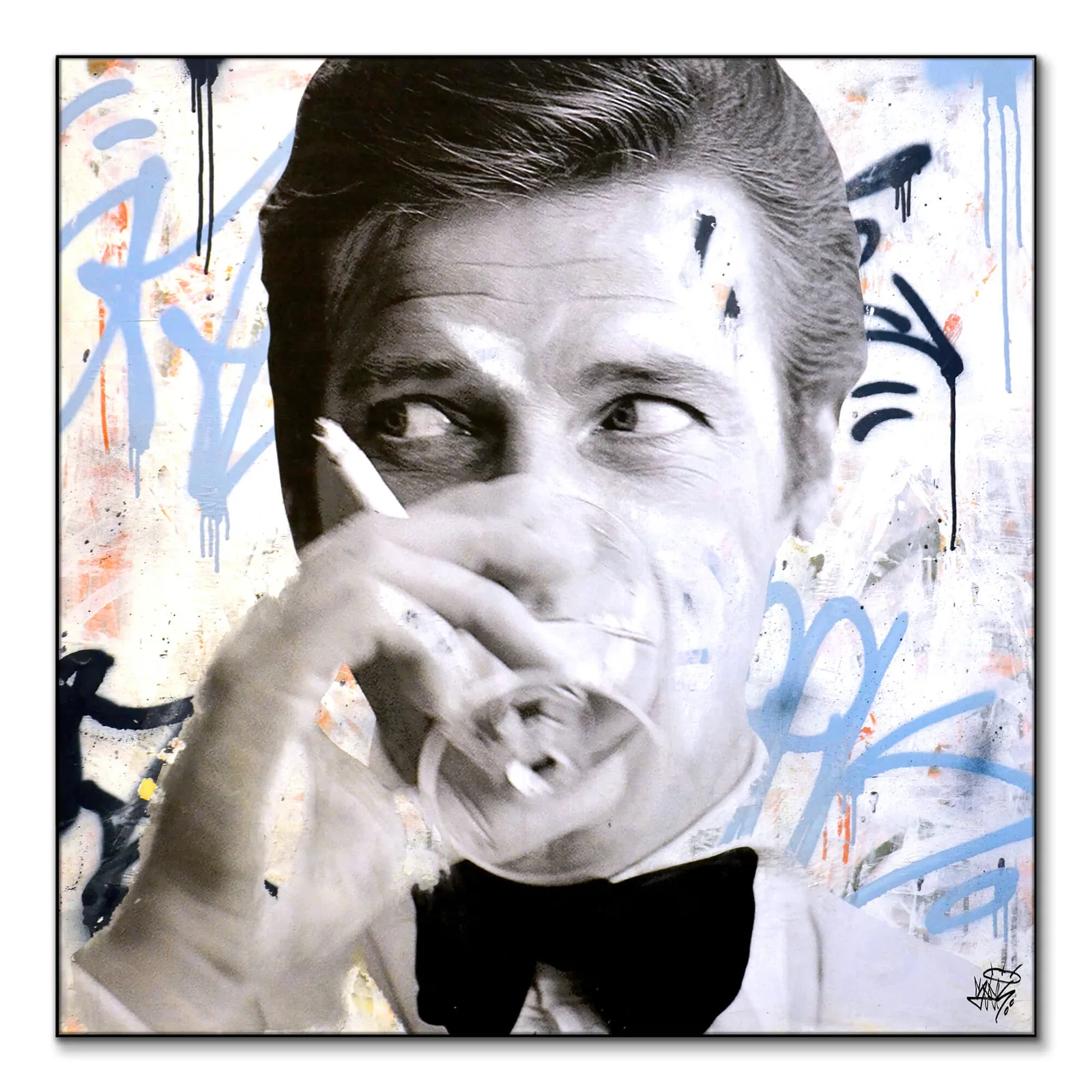
For color pop culture pieces, look for unexpected connections. A piece with vibrant reds or deep blues might find a surprising companion in a sunset photograph or an abstract interpretation of a stormy sky. The James Bond Martini print, with its likely sophisticated color palette, could pair beautifully with nature prints featuring silvery birch trees or misty mountain scenes—both convey a certain cool elegance.
Don't overlook neutrals as bridges. Beige, taupe, cream, and gray are abundant in nature photography—think bark, stone, sand, fog—and these neutral-heavy pieces can mediate between more colorful or high-contrast pop culture works. They give the eye a place to rest without creating dead zones in your arrangement.
Strategic Placement Techniques
How you physically arrange mixed-genre pieces matters enormously. The most common mistake is creating visual segregation—all pop culture on one wall, all nature on another. This defeats the purpose of mixing them and can make a room feel divided against itself.
James Bond Martini
Seek One · Featured in this article
Instead, try the alternating rhythm approach. If you're creating a gallery wall, alternate between genres rather than grouping them. Place a bold pop culture piece, flank it with nature prints, then introduce another pop culture work. This creates a visual rhythm that guides the eye around the entire arrangement rather than letting it fixate on individual pieces.
Consider using size strategically. Let your largest pop culture piece anchor the arrangement, then surround it with smaller nature prints. Or reverse it—create impact with an oversized nature photograph and punctuate the space with smaller pop culture works. The I Defy Gravity print, with its likely powerful statement, could serve as a dramatic anchor with more delicate nature studies arranged around it.
The diptych or triptych approach also works beautifully. Pair a pop culture piece directly beside a nature print of similar size and framing. This direct juxtaposition creates an intentional dialogue between the two pieces. You might place them above a sofa, over a credenza, or flanking a doorway. The key is making the pairing feel deliberate rather than accidental.
For rooms with multiple walls, distribute the mix rather than concentrating it. Put a pop culture piece above your desk with a nature print on an adjacent wall. Hang a small cluster of mixed pieces in one corner and a single statement work of either genre across the room. This distribution prevents the mixing from feeling like a one-off experiment and instead establishes it as your aesthetic point of view.
Working With Frames and Matting
Framing choices can either unify or fragment a mixed collection. The safest route is consistency in framing style across both genres. If you frame everything in simple black frames with white mats, that continuity creates cohesion even when the imagery varies wildly. This approach lets the art speak without the frames adding another layer of visual complexity.
Alternatively, you can use framing as a subtle genre marker while maintaining overall consistency. Frame all your pop culture pieces in sleek black metal frames and your nature prints in warm wood frames, but keep the proportions and mat widths identical. This creates subtle differentiation without disrupting the overall harmony.
Mixed metallics—combining gold, silver, brass, and copper frames—is a riskier approach but can work if you're going for an intentionally eclectic, collected-over-time look. The key is distributing the different frame finishes evenly throughout the arrangement rather than clustering them. You don't want all your gold frames on pop culture pieces and all your black frames on nature prints.
Mat color deserves attention too. White or off-white mats are the default for good reason—they work with everything and create breathing room around artwork. But don't be afraid to use colored mats strategically. A deep charcoal mat can add sophistication to both a moody forest scene and a dramatic portrait. A warm cream mat might unify pieces with different color temperatures.
Creating Thematic Conversations
The most sophisticated mixed-genre displays create thematic dialogues between pieces. Look for conceptual connections beyond pure aesthetics. A piece featuring human triumph or determination pairs meaningfully with nature imagery showcasing power or grandeur—think dramatic mountain peaks or stormy seas. Work like Mellisonant Fall, with its likely autumnal theme, could converse with pop culture pieces that deal with time, change, or nostalgia.
I Defy Gravity
Michiel Folkers · Featured in this article
Movement is another connecting theme. Nature prints with flowing water, wind-bent grasses, or birds in flight echo the energy and dynamism often present in pop culture photography. The stillness of a contemplative portrait can be beautifully offset by the implied motion in a waterfall photograph.
Consider pairing pieces that share an emotional quality rather than a visual one. Melancholic pop culture imagery—think moody portrait photography—resonates with misty forest scenes or overcast coastal prints. Energetic, celebratory pop culture works find companionship with nature prints featuring brilliant sunlight or vibrant wildflower fields.
You can also play with contrast as your theme. Pair the ultimate in human artifice—celebrity culture, cinema, music icons—with the raw authenticity of wilderness photography. This juxtaposition comments on both genres without either overpowering the other. It's a conversation about what we create versus what simply exists.
Scaling Your Mix Throughout a Room
Once you've established your mixing principle on one wall or in one arrangement, carry it through the entire room in smaller ways. If you've created a mixed gallery wall as your focal point, echo the combination elsewhere. Place a single pop culture piece on a bookshelf next to a small framed botanical print. Lean mixed pieces on your mantel or console table.
This repetition throughout the space makes your mixing feel intentional rather than arbitrary. It signals that this is your considered aesthetic approach, not an accident of not having enough of either genre to fill your walls. The repetition also prevents any single arrangement from feeling too precious or overcurated.
Consider how your arts & crafts collection can expand vertically through a room as well. Don't limit mixed arrangements to traditional gallery wall height. A tall nature print might extend from near the baseboard to eye level, with a smaller pop culture piece hung higher on the same wall. This vertical mixing adds another dimension to your approach.
Think about sightlines too. When you stand in a doorway, can you see examples of both genres? This doesn't mean everything needs to be visible from every angle, but distributing your mix so that most viewpoints include both types of imagery strengthens the overall effect. You want someone walking through your home to understand your aesthetic immediately, not discover it piecemeal.
The integration of everyday objects matters in mixed-genre spaces. If your shelving units or surfaces only display objects that align with one genre—say, all natural elements like plants, stones, and driftwood—the pop culture art can feel like an afterthought. Similarly, if every surface is pop culture merchandise, your nature prints might seem like an attempt to offset the excess. Aim for mixed objects on surfaces to support your mixed walls.
When to Break Your Own Rules
Even with thoughtful mixing, some pieces simply won't play well together, and that's fine. If you have a particularly precious or valuable pop culture piece that you feel gets diminished by proximity to nature prints, give it its own moment. Not everything needs to participate in every conversation. A single-piece wall can provide punctuation and breathing room in a home full of mixed arrangements.
Mellisonant Fall
Frank Moth · Featured in this article
Similarly, if you find that a particular room feels right with purely one genre, trust that instinct. Maybe your bedroom truly functions better as a calm space with only nature prints, while your living room celebrates the mix. Maybe your home office thrives with pop culture inspiration while your entryway welcomes people with serene landscapes. Mixing is a tool, not a mandate.
Pay attention to scale mismatches that don't resolve. If your pop culture pieces are all large-scale and dramatic while your nature prints are all small and delicate, the pairing might feel like bullying rather than dialogue. In this case, either scale up your nature prints, scale down your pop culture works, or introduce mid-sized pieces of both genres to bridge the gap.
Watch for color chaos too. If mixing creates a space where no two pieces share any color relationship and everything fights for attention, you've likely pushed too far. This doesn't mean giving up on mixing—it means editing down to pieces that share at least some color family or tonal relationships.
Making It Work in Different Room Types
Living rooms and family rooms are natural homes for mixed-genre displays because they accommodate diverse activities and moods. These spaces benefit from visual interest and personality, and the mixed approach prevents them from feeling either too serious or too frivolous. A conversation-starting arrangement above the sofa sets the tone for a space that's both comfortable and considered.
Bedrooms require more careful calibration. The pop culture elements should be pieces that genuinely relax or inspire you rather than just culturally significant works you feel you should display. Nature prints typically excel in bedrooms because they promote calm, so the ratio might tilt heavily toward nature with just one or two beloved pop culture pieces providing personality.
Home offices and creative spaces thrive on the mixed approach. Pop culture pieces can provide motivational energy and creative inspiration, while nature prints prevent the space from becoming visually exhausting during long work sessions. This balance supports both focus and imagination.
Dining rooms present an interesting opportunity. These are often showcase spaces where you can be more experimental and bold. A dramatic mixed arrangement in a dining room creates conversation and sets a sophisticated tone. Just ensure pieces are high enough to avoid food splatter and that the mix complements rather than clashes with your table and chairs.
Hallways and entryways benefit from mixing because these transitional spaces often get treated as afterthoughts. A thoughtful mixed display signals that you've considered every square foot of your home. Keep scale appropriate to the space—narrower hallways need smaller pieces or vertical arrangements that don't overwhelm the passageway.
Frequently Asked Questions
The integration of pop culture art with nature prints offers a refreshing departure from single-genre displays, creating spaces that reflect the full spectrum of our interests and influences. By focusing on color relationships, strategic placement, and thematic connections, you can develop arrangements that feel both intentional and effortlessly curated. Whether you're starting with a single pairing or reimagining an entire room, the mixed approach rewards careful attention to balance, scale, and the subtle conversations between pieces.
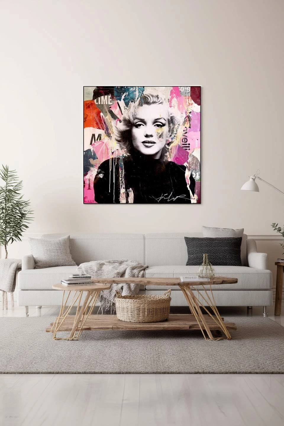
Marilyn Monroe Collage
Michiel Folkers · Featured in this article
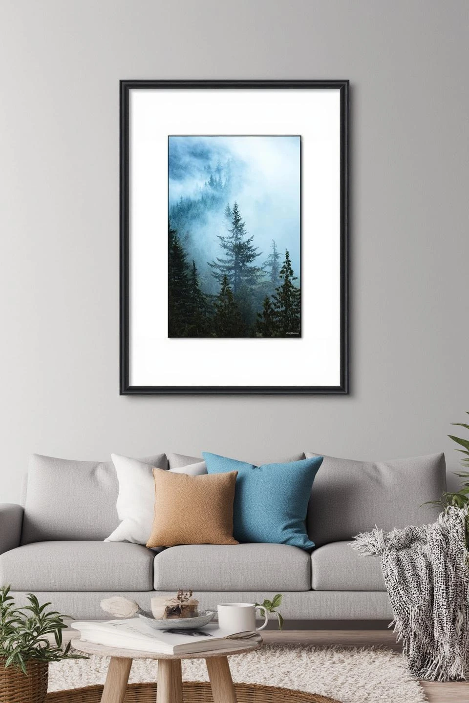
Hazy Treetops
Jared Q. Gunderson · Featured in this article