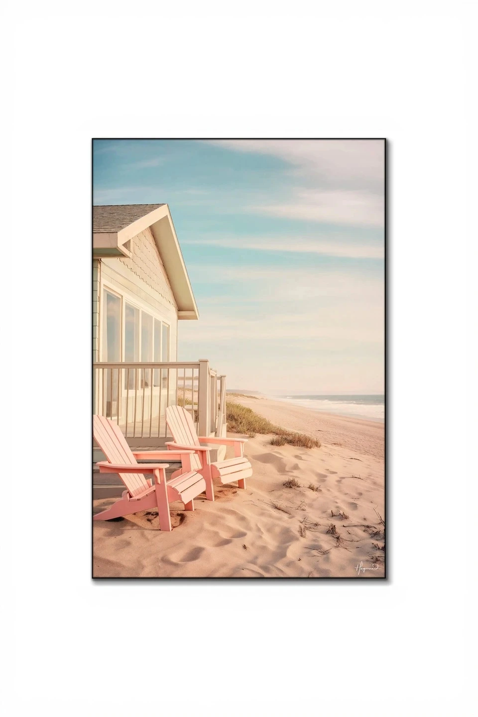
Gallery walls have evolved far beyond the matching-frame-matching-mat formula of decades past. Today's most compelling wall arrangements embrace tension and dialogue between contrasting styles, creating visual interest that feels both curated and personal. The secret isn't in finding art that all looks the same—it's in building a collection where disparate pieces feel like they belong together despite their differences.
The challenge, of course, is walking the line between "intentionally eclectic" and "chaotic jumble." When you're mixing abstract expressionism with vintage photography, contemporary minimalism with maximalist illustration, the composition requires more thought than a uniform grid of black-framed prints. But the payoff is a gallery wall that tells a richer story and holds your attention longer than any single-style arrangement ever could.
Understanding Visual Weight and Balance
Before you hammer a single nail, you need to grasp visual weight—the perceived "heaviness" of each piece based on size, color intensity, complexity, and frame style. A small, dark abstract painting can carry as much visual weight as a large, pale photograph. When mixing contrasting styles, balancing these weights across your wall keeps the arrangement from feeling lopsided.
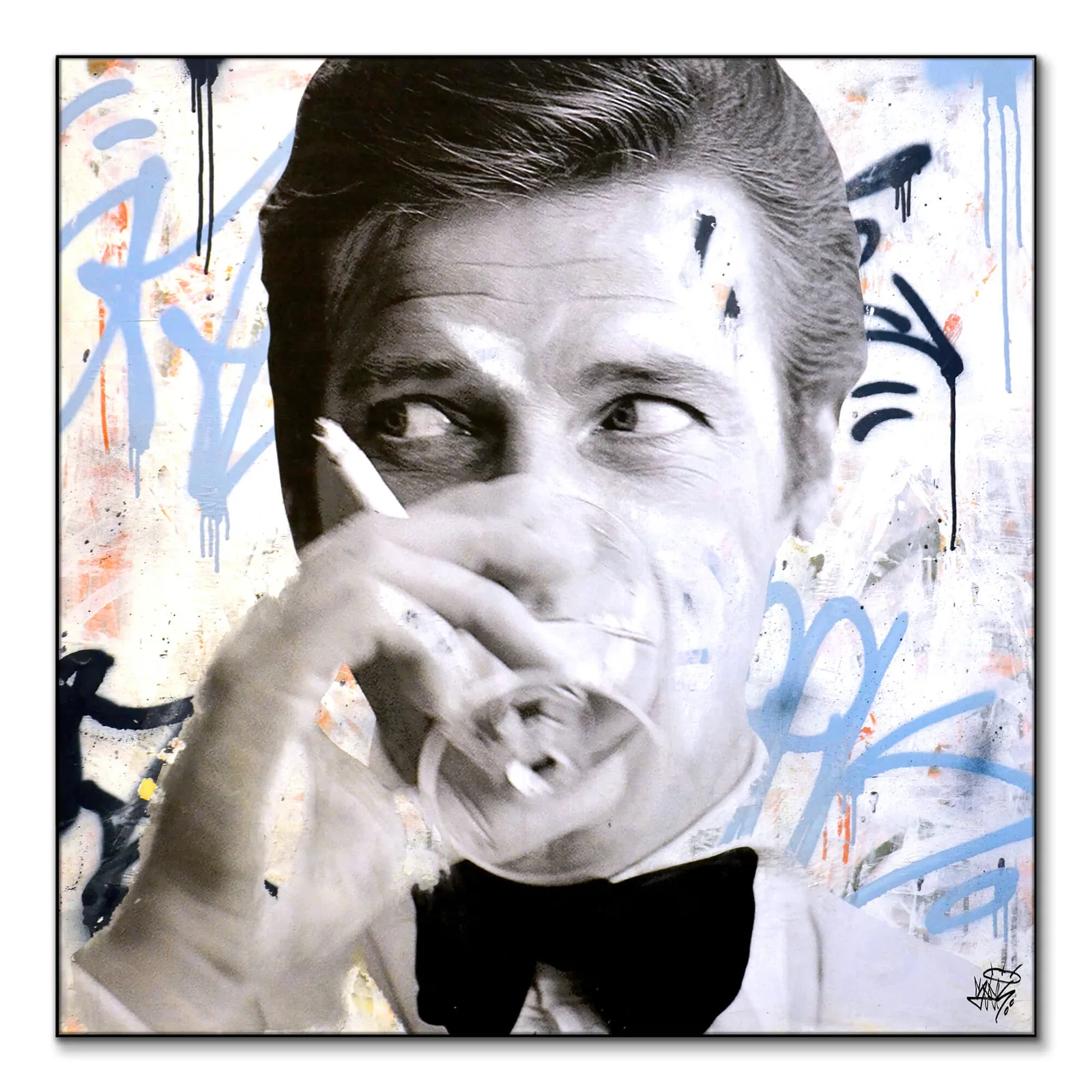
Start by laying all your pieces on the floor and identifying which command the most attention. Bold, saturated works like *James Bond Martini*—with its graphic pop-art aesthetic—naturally draw the eye more than subtle landscapes. These high-impact pieces should anchor your arrangement, typically positioned slightly off-center or in the lower third of your composition. Distributing visual weight means you're not clustering all your bold pieces on one side while relegating quieter works to the margins.
Consider the negative space within each artwork, too. A minimalist line drawing has built-in breathing room, while a densely detailed illustration fills every inch. When these live side-by-side, the contrast in internal density adds to the dynamic tension you're building. Balance a busy piece with something calmer nearby, creating rhythm as the viewer's eye moves across the wall.
Establishing Your Unifying Thread
Every successful multi-style gallery wall has at least one element that creates cohesion across the disparate pieces. Without this common thread, you're just putting unrelated things next to each other. The thread could be a shared color palette, similar subject matter, consistent framing approach, or even a mood.
Color is the most forgiving unifying element when working with contrasting styles. You might pull together abstract geometric prints, vintage botanical illustrations, and modern photography by ensuring they all share warm earth tones, or by limiting yourself to black-and-white pieces with one accent color repeated throughout. Even if your styles range from traditional to avant-garde, a disciplined color strategy makes them feel intentional together.
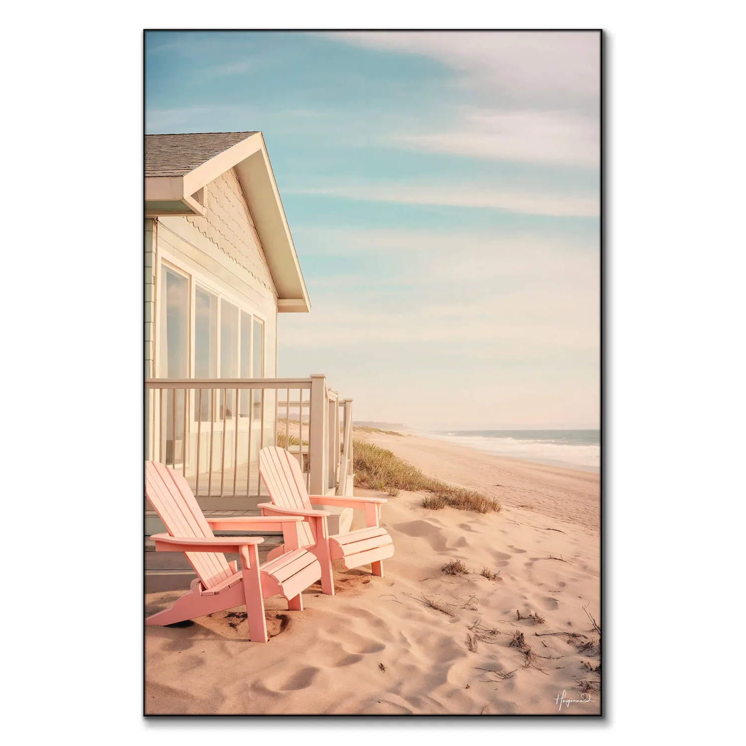
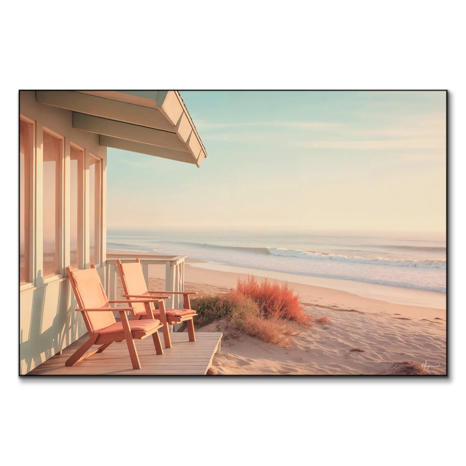
Subject matter works similarly. Coastal themes, for instance, can span vastly different artistic approaches—from impressionistic seascapes like Along the Beach to more graphic interpretations like Sandy Coastal Dreams. The subject provides continuity while the style variations keep things interesting. Just avoid being too literal about it; "things that are blue" is less effective than "pieces that evoke water in different ways."
Frame choice is another powerful unifying tool. Using identical frame profiles in varying sizes creates instant cohesion, even when the art inside ranges from abstract to representational. Alternatively, you might vary frame styles but stick to one finish—all brass, all natural wood, all black—letting the frames be distinct but related.
Arranging for Rhythm and Flow
The physical layout of your gallery wall controls how viewers experience the contrasts you've assembled. Poor arrangement can make even thoughtfully selected pieces feel random, while smart composition creates a visual journey across the wall.
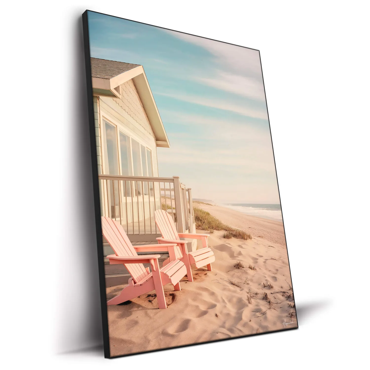
Along the Beach
PARTB Curated · Featured in this article
The salon-style hang—tightly grouped pieces of varying sizes covering a wall section—works beautifully for contrasting styles because the density itself unifies the collection. Keep 2-3 inches between frames consistently, treating the entire grouping as a single shape rather than individual elements. Within that shape, place your largest or most visually dominant piece first (not necessarily centered—slightly off-center often feels more dynamic), then build outward.
Grid arrangements offer a different approach: the rigorous geometry of equally spaced pieces in rows and columns provides structure that allows wildly different styles to coexist peacefully. This works especially well when you have pieces of similar size but vastly different aesthetics. The grid says "these differences are intentional," giving viewers permission to appreciate the variety.
For longer horizontal walls, consider a linear arrangement where pieces align along a central horizontal line (typically 57-60 inches from the floor—standard gallery height). Vary the sizes above and below this line, but maintain that spine of alignment. This creates order while accommodating different frame sizes and orientations.
Playing with Scale and Proportion
Scale variation is essential when mixing contrasting styles—uniform sizing can make different aesthetics compete rather than complement. A gallery wall with all 16x20 prints in different styles often feels more chaotic than one where sizes deliberately vary.
Use your largest pieces to anchor the composition and establish territory for each major style you're incorporating. If you're mixing geometric abstraction with nature photography and vintage illustration, let each style have at least one substantial presence rather than representing each with only small prints. This prevents any single approach from reading as an afterthought.
Small pieces gain importance through grouping. Three 5x7 prints in one style, hung close together, create their own sub-unit that can hold its ground next to a single large piece in a contrasting style. This clustering technique lets you include delicate or subtle works that might disappear if scattered among bolder pieces.
Consider proportion relationships between adjacent pieces, too. A tiny 4x6 print hung directly next to a 30x40 canvas can feel awkward, but that same small print positioned slightly away, perhaps with a medium-sized piece between them, finds its place in the overall rhythm.
Testing and Adjusting Before Committing
The biggest mistake in gallery wall installation is committing to nail placement before you've lived with the arrangement. Paper templates taped to the wall give you a risk-free testing ground, but there's an even better approach for contrasting-style collections.
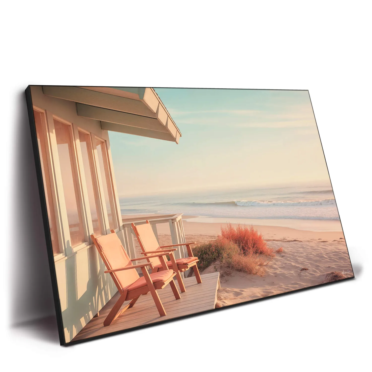
Sandy Coastal Dreams
PARTB Curated · Featured in this article
Cut paper or kraft paper to match each frame's outer dimensions and tape these templates to your wall in your planned arrangement. Live with it for several days. The contrasts that seemed bold and exciting at first might start feeling jarring, or that careful balance might reveal itself to be slightly off. You'll notice which pieces draw your eye repeatedly and which get lost—information you can use to adjust before you're filling nail holes.
Photography is invaluable here. Take pictures of your template arrangement from different angles and at different times of day. You'll often spot issues in photos that your eye skips over in person: pieces that blend together too much, awkward gaps, unintentional diagonal lines that create visual tension.
When you're finally hanging, start with the center or anchor piece, then work outward. But keep a few pieces on the floor as you go—you might discover in the actual installation that a different piece works better in a particular spot than what your template suggested. The ability to swap pieces mid-installation is your secret weapon for achieving that "it just works" quality.
Our full Arts & Crafts collection offers pieces spanning multiple aesthetics, making it easier to build a contrasting-yet-cohesive selection for your gallery wall.
Working with What You Already Own
You don't need to start from scratch to create a compelling multi-style gallery wall. Most people already own pieces in different styles—they've just never considered hanging them together. That landscape from a trip five years ago, the abstract print you bought last month, and the vintage illustration you inherited might form the beginning of your gallery wall.
Assess what you have with fresh eyes, looking for those unifying threads discussed earlier. Sometimes reframing changes everything—putting several pieces in matching frames instantly creates cohesion that allows their style differences to shine rather than clash. White or natural wood mats can standardize disparate print sizes and help contrasting pieces feel part of the same family.
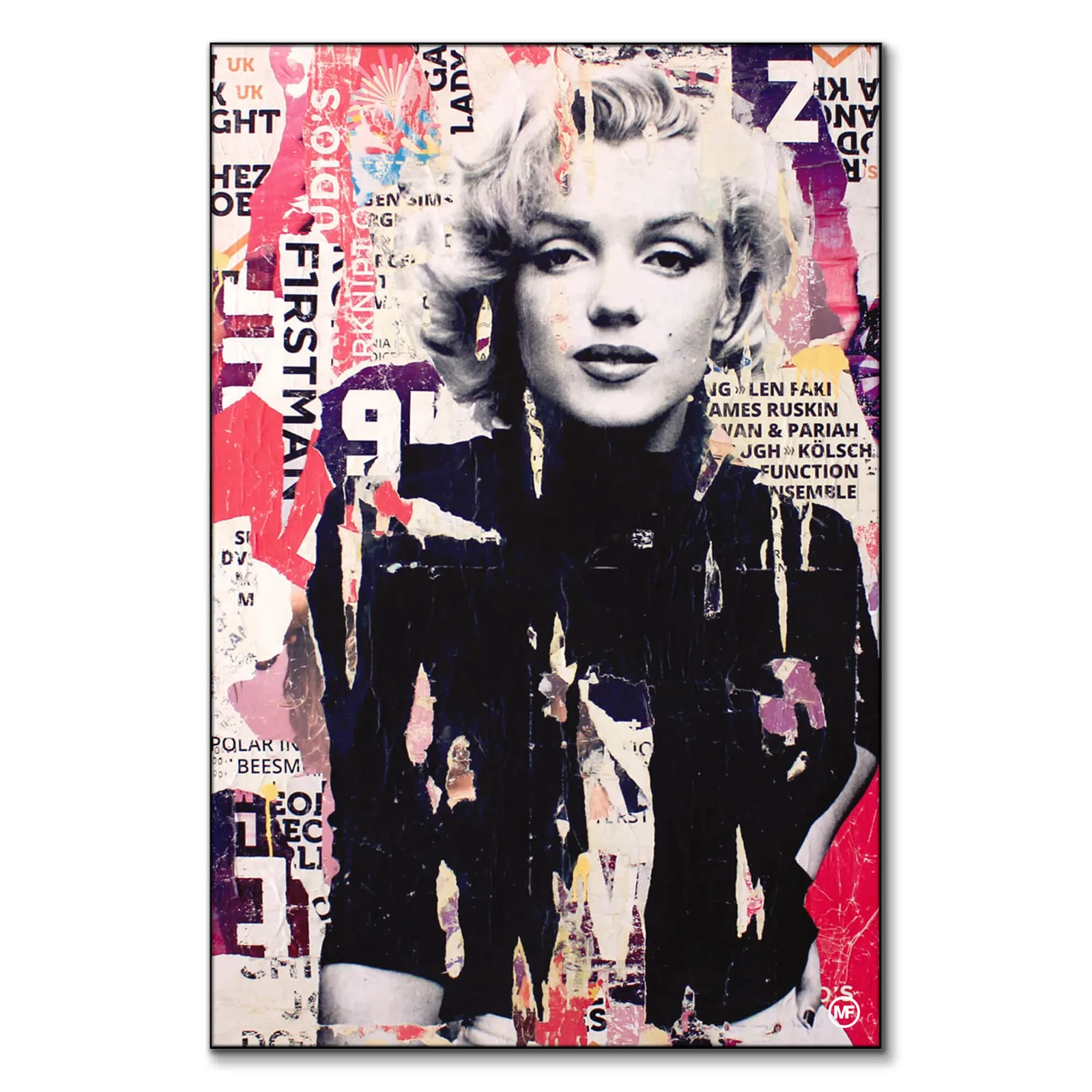
If you're adding new pieces to mix with existing favorites, choose based on what's missing rather than what you already have more of. If your current collection skews heavily toward muted photographs, introducing something with more graphic punch—perhaps something with the saturated color and bold composition of *Mellisonant Fall*—creates the contrast that makes a gallery wall interesting.
Don't force pieces that truly don't belong. If you've tried multiple arrangements and groupings and that one piece still feels wrong, it's okay to exclude it. A successful gallery wall often means being selective, not just inclusive.
Frequently Asked Questions
Following this guide will help you create a gallery wall where contrasting art styles feel intentional and sophisticated rather than accidentally mismatched. The dialogue between different aesthetics is what gives these arrangements their lasting visual interest—they reward repeated viewing in ways that uniform collections simply can't match.

James Bond Martini
PARTB Curated · Featured in this article
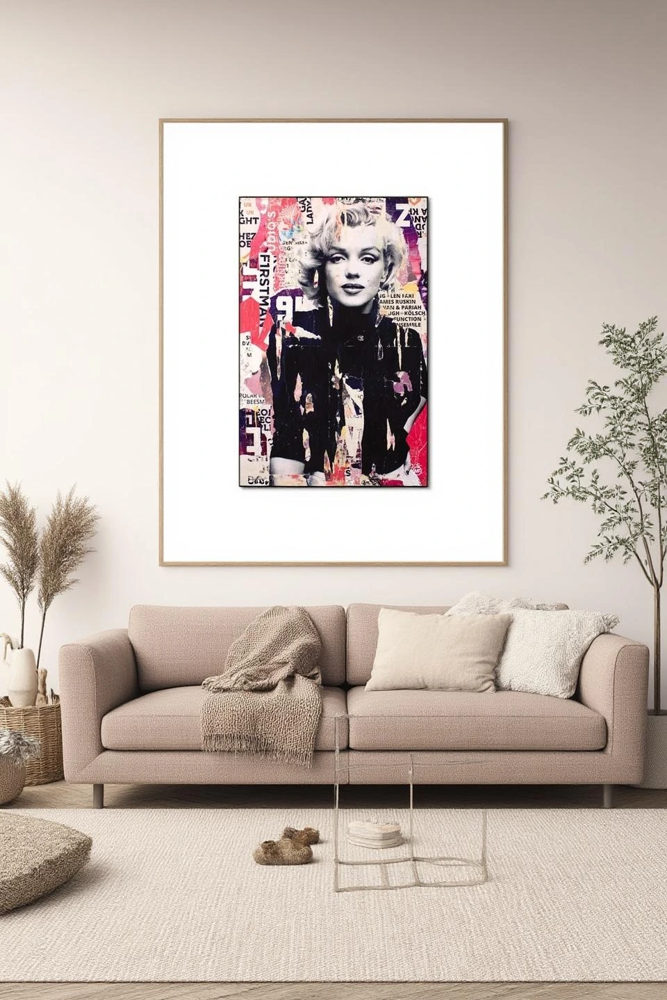
I Defy Gravity
PARTB Curated · Featured in this article
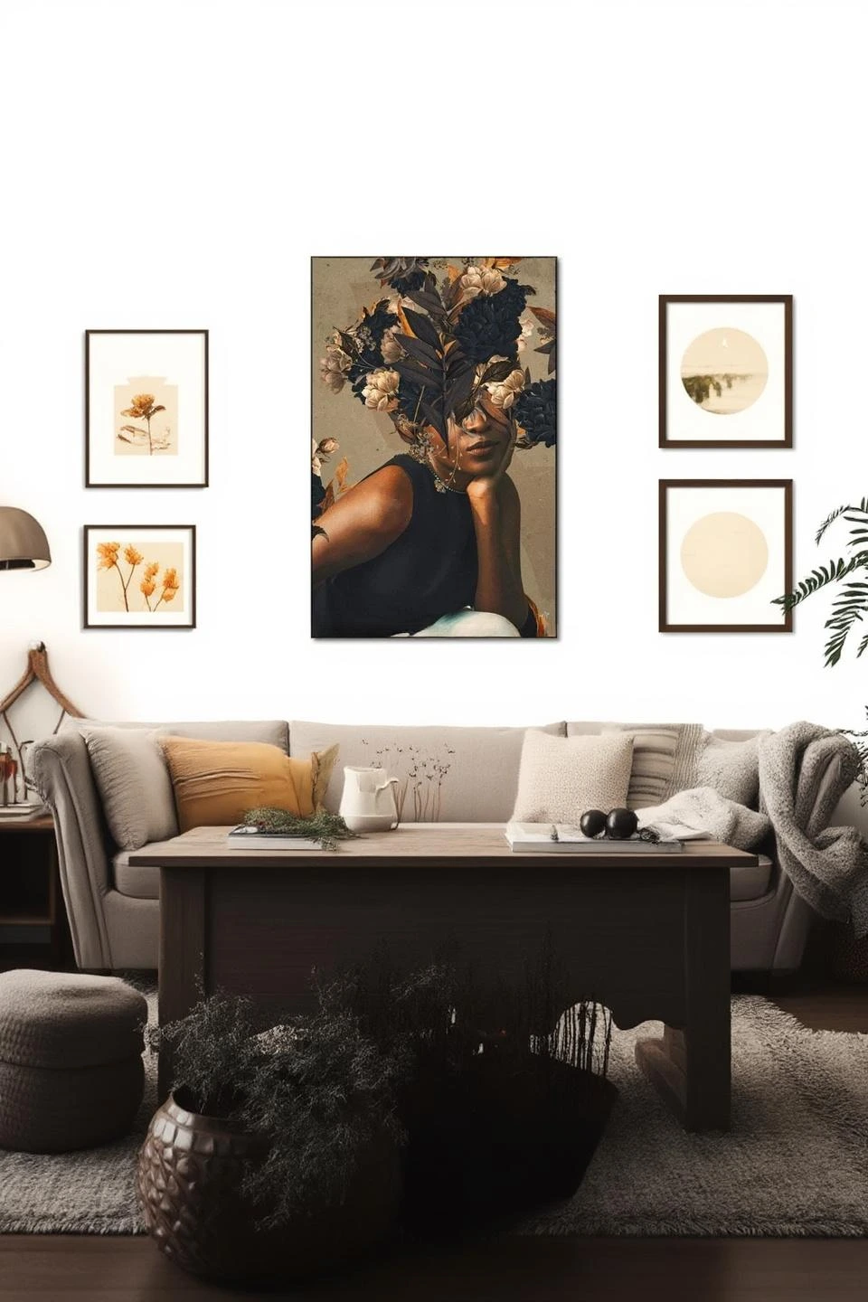
Mellisonant Fall
PARTB Curated · Featured in this article